Hi,
This is Eugene Uchuvatkin from HomeIncomeWorld. You connected with me because you signed up to one of the traffic sites as my downline, opted in for one of my reports, or subscribed to the "Amazing Credits Giveaway".
Over the last few weeks, I have been reporting many times that Viral Mailer For You is my best converting site. And the best way to promote at the site is using "Headline Ads".
Thanks to "Headline Ads", 51 subscribers joined my email list in the last month.
Conversion rates are awesome. It takes 4 to 5 visitors to get 1 subscriber.
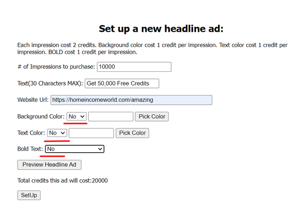
Some people (including me) were amazed to see such results. So they wanted to know how to set up "Headline Ads" to get more clicks. What color to use? What text? Background? How many impressions do you need to see results?
The only answer would be: "Test it".
However, there are some tips I will share with you to make your testing easier.
First of all, I recommend focusing on the actual text of your ad.
You need to come up with short text (30 characters max) that makes your prospect click it. It must be something compelling. Something that they are looking for. In my case, it is "Get 50,000 Free Credits".
I don't recommend using bold text and background color during the initial testing. It will be wasting your credits. Here's why.
In the beginning, my text was white with a red background and bolded. Each impression cost 5 credits. I spent 690,000 credits to get 504 clicks. The cost per click was 1,369 credits.
Then I removed the text format and kept it simple without colors. This time 180,000 credits turned into 247 clicks. The cost per click is 729 credits. Almost as half fewer credits as in the first case.
Another reason I don't recommend coloring your texts is that it repels prospects. On Monday, I wrote to you about how bad advertising can make them run away. If you missed that email you can read it by clicking here.
You might be thinking my opinion is too subjective. After all, everyone colors their texts to grab more attention. My numbers admit that too. In order to get 1 click, it needed 274 impressions of colored text vs. 729 impressions of the simple one.
However, visitors that came by clicking the colored text converted into subscribers with ratio 504/79 or 6.3:1.
In the second case, conversion rates were 247/51 or 4.8:1.
Although both numbers are outstanding, the second one is 25% better! In other words, if I used colored text, I would lose every fourth subscriber.
Simple text converts better than a colored one because it attracts really interested visitors. Forget about what others do unless you want more clicks than subscribers.
So, go to the "Headline Ads" page and set up your ad as I did. Make sure, you use your text with URL and not mine.